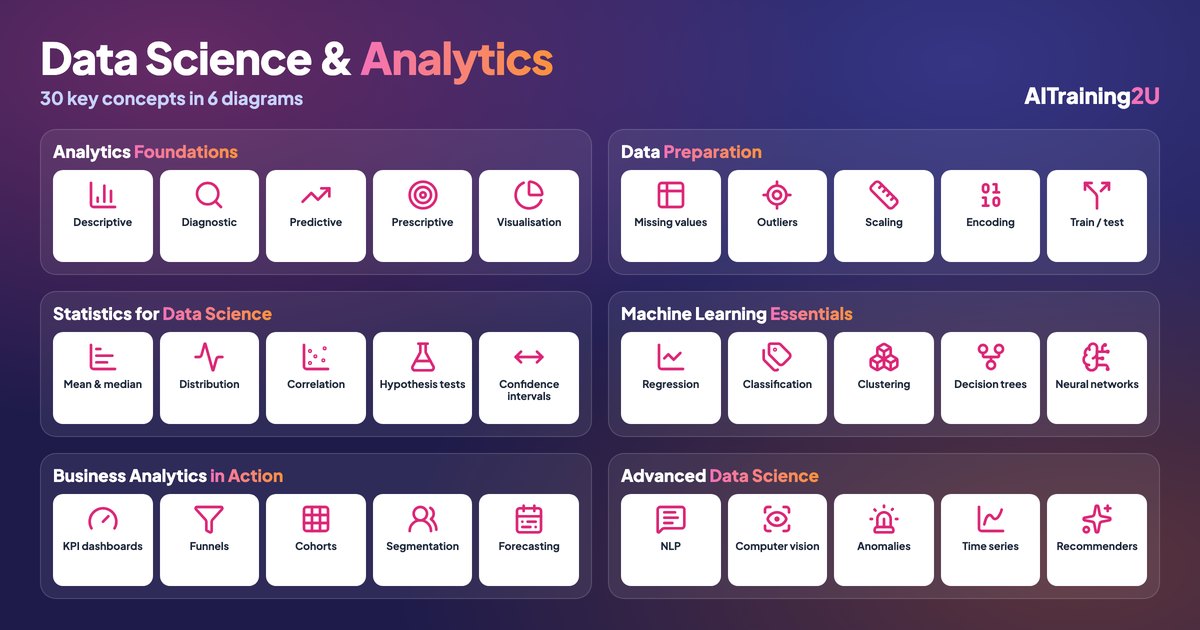
Short answer: data analytics explains what happened and why, using data you already have. Data science goes further, building models that predict what will happen and recommend what to do. Between them sit about 30 core ideas that anyone working with data meets sooner or later. This guide groups them into six diagrams: analytics foundations, data preparation, statistics, machine learning, business analytics in practice, and advanced data science.
You do not need all 30 on day one. A finance executive building a monthly dashboard lives mostly in diagrams 1, 2 and 5. Someone building a churn model needs 2, 3 and 4. The diagrams are here so you can see where each idea sits, and which ones your work depends on.
- Analytics foundations: the four types of analytics, plus visualisation
- Data preparation: getting data fit to analyse
- Statistics for data science: the ideas behind every trustworthy number
- Machine learning essentials: the five model families you will meet first
- Business analytics in action: the analyses managers actually ask for
- Advanced data science: language, images, anomalies, time and recommendations
1. Analytics foundations: the four questions
The four types of analytics are really four questions, each harder than the last. Descriptive analytics answers “what happened?”: last month’s sales by outlet, this quarter’s overtime hours. Most company reporting stops here, and that is fine for plenty of decisions.
Diagnostic analytics asks why. Sales fell 12% in Johor; was it one product, one outlet, one week, or a price change? It means cutting the same data by different dimensions until the cause shows itself. Predictive analytics uses patterns in past data to estimate what comes next, such as next month’s demand or which customers are likely to stop buying. Prescriptive analytics goes one step further and recommends an action: order 340 units, not 500; offer this customer free delivery, not a discount.
Data visualisation runs through all four. A good chart turns a table nobody reads into a point everybody sees. The test is simple: can a manager state the conclusion after five seconds of looking?
| Type | Question | Typical output | Difficulty | Who usually does it |
|---|---|---|---|---|
| Descriptive | What happened? | Monthly sales report, dashboard | Low | Analyst, spreadsheet |
| Diagnostic | Why did it happen? | Drill-down, variance analysis, cohort comparison | Medium | Analyst with domain knowledge |
| Predictive | What will happen? | Forecast, churn score, demand model | High | Analyst or data scientist |
| Prescriptive | What should we do? | Reorder quantities, pricing, next-best offer | Highest | Data scientist plus the business owner |
The four types of analytics compared. Value tends to rise with difficulty, but so does the data quality you need.
For where AI now speeds up each of these, see AI for data analysts: what changes in your day.
2. Data preparation: where most of the time goes
Every analysis inherits the quality of its data, which is why preparation takes so much of an analyst’s time. Missing values are the first problem: a blank postcode, a missing sale date. You can fill them (with a median, or a value from another system), remove the rows, or flag them. The wrong choice quietly biases the result, so write down which you picked.
Outlier detection finds points that do not fit, such as a RM48,000 order in a shop where the average is RM180. Some outliers are errors; some are your best customer. Check before deleting. Normalisation puts numbers on the same scale, typically 0 to 1, or a mean of zero and standard deviation of one, so that a column measured in ringgit does not drown out one measured in percentages. Categorical encoding converts labels such as “Selangor”, “Penang”, “Sabah” into numbers a model can use, usually one column per category.
The train/test split is the habit that separates real models from wishful ones. You hold back part of the data, often 20 to 30%, and never let the model see it during training. Only its score on that held-back data tells you how it will do on next month’s customers.
Where AI helps most: spotting inconsistent formats, suggesting fixes for missing values and writing the cleaning code. Where it does not: deciding whether an odd value is a mistake or a real event. That still needs someone who knows the business. More in data cleaning with AI, 9 problems in every business file and the six dimensions of data quality.
3. Statistics for data science: trusting the numbers
Mean, median and mode are three ways to describe a typical value, and they disagree whenever data is skewed. Average salary in a company with a highly paid founder is misleading; the median tells you what the middle person earns. Distribution is the shape of the data: bunched in the middle, stretched to one side, or with two peaks that suggest two different customer types mixed together.
Correlation measures how two variables move together, on a scale from −1 to +1. It is the most misused number in business. Ice-cream sales and drowning incidents are correlated because both rise in hot weather, and neither causes the other. Our piece on correlation vs causation shows how this catches out marketing teams.
Hypothesis testing asks whether a difference is real or could be chance. When version B of a landing page converts at 3.4% and version A at 3.1%, a test tells you whether to believe it; see A/B testing for business teams. A confidence interval gives a range instead of a single number: “conversion is between 2.9% and 3.9%, with 95% confidence” is more honest than “conversion is 3.4%”. For eight methods with worked business examples, read the statistics behind everyday business decisions.
4. Machine learning essentials: five model families
Machine learning is a set of methods that learn patterns from examples instead of following rules someone wrote by hand. Five families cover most business use.
- Regression predicts a number: next week’s sales, a property’s price, delivery time in minutes.
- Classification predicts a category: will this invoice be paid late, is this transaction fraud, which department should handle this ticket.
- Clustering finds groups nobody labelled in advance, such as customers who buy in similar ways. It is the basis of most modern customer segmentation.
- Decision trees learn a sequence of yes/no rules. They are easy to explain to a manager, which is why they are often the first model worth trying. Ensembles of many trees (random forests, gradient boosting) are behind a large share of production models on business data.
- Neural networks learn complex, non-linear patterns and power today’s language and image AI. On a typical spreadsheet of business data they are often no better than a tree-based model, and much harder to explain.
The model is the smallest part of a machine-learning project. Framing the question, preparing data and checking results in the real business take most of the effort, which is the point of the CRISP-DM lifecycle.
5. Business analytics in action
These five are the analyses managers ask for by name. A KPI dashboard shows the handful of numbers that matter, updated without anyone pasting data every Monday. The discipline is choosing five KPIs, not fifty.
Funnel analysis follows people through the stages of a process (visited, enquired, quoted, paid) and shows where they drop off. The biggest drop is usually where the next ringgit of effort pays back best. Cohort analysis groups customers by when they started, such as everyone who first bought in January, and tracks how each group behaves over time. It answers questions a plain monthly total hides, like whether customers acquired during a promotion stay as long as the rest.
Customer segmentation groups similar customers so you can treat them differently. RFM analysis (recency, frequency, monetary value) is the fastest way to start. Forecasting predicts demand so you can plan stock, staff and cash; our plain-language forecasting guide covers the methods and the common traps.
6. Advanced data science
The last group is where data science meets modern AI. Natural language processing pulls meaning out of text: classifying support emails, summarising contracts, measuring sentiment in reviews. Large language models have made this dramatically cheaper since 2023. Computer vision does the same for images and video, such as reading receipts, checking shelf layouts or counting people at an entrance.
Anomaly detection flags rare events: a suspicious payment, a machine sensor drifting before it fails, an expense claim that looks unlike the rest. It overlaps with outlier detection in diagram 2, but runs continuously on live data. Time series analysis models data ordered in time, separating trend, seasonality (Hari Raya, Chinese New Year, year-end) and noise. Recommendation systems suggest the next product, article or course based on what similar people chose.
For how generative AI has changed the day-to-day work of data science, and what it has not changed, read AI data science in 2026.
Where to start
If you work in a business role, learn diagrams 1, 3 and 5 properly and you will read any report more critically than most of your colleagues. If you want to build models, add 2 and 4, and practise on your own company’s data rather than tutorial datasets. The ideas in diagram 6 come later, and increasingly arrive packaged inside tools you already use.
Two hands-on days using AI to clean data, build dashboards and run the analyses in this guide on your own company’s files. No coding background needed.
Public dates coming soon — in-house classes run on your dates.
HRD Corp claimable. AITraining2U is an HRD Corp registered training provider. Our public and in-house courses are claimable under the HRD Corp Claimable Courses (SBL-KHAS) scheme, and we prepare the grant paperwork with you. See HRDC-claimable AI training: courses, costs and how to claim.